

ARNOTTS WEBSITE AUDIT + BRAND UPLIFT + Content CREATION

Digital audit, updated content matrix and website uplift for Arnott's.
Experience and Content Audit to define enhancement opportunities. Re-organisation of hundreds of products nomenclature and hierarchy to form a new content matrix and inform a content migration. Future-proofing their information architecture with an updated way-finding system, creating experience principles for them to live by moving forward with their brand, making sure that every digital touchpoint is inclusive and consistent. Implementing new content opportunity sections and developing their brand story and history. And lastly updating the visual design system with a refreshed look and feel.


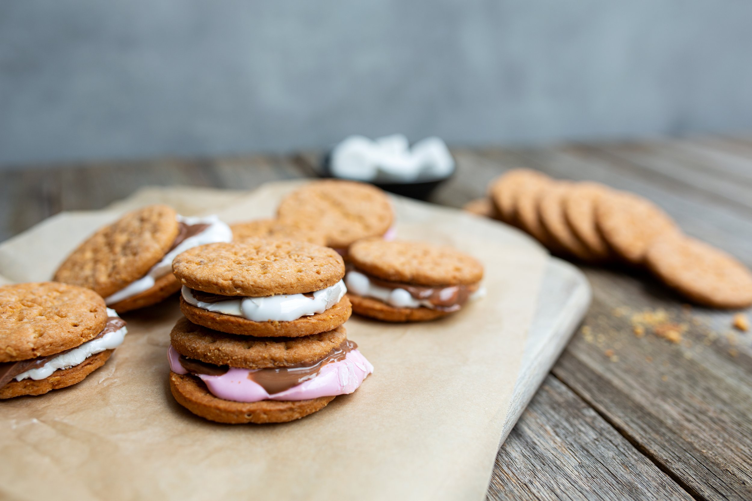


Internal photoshoot done for recipe hub / STYLING / ART DIRECTION / PHOTOGRAPHY


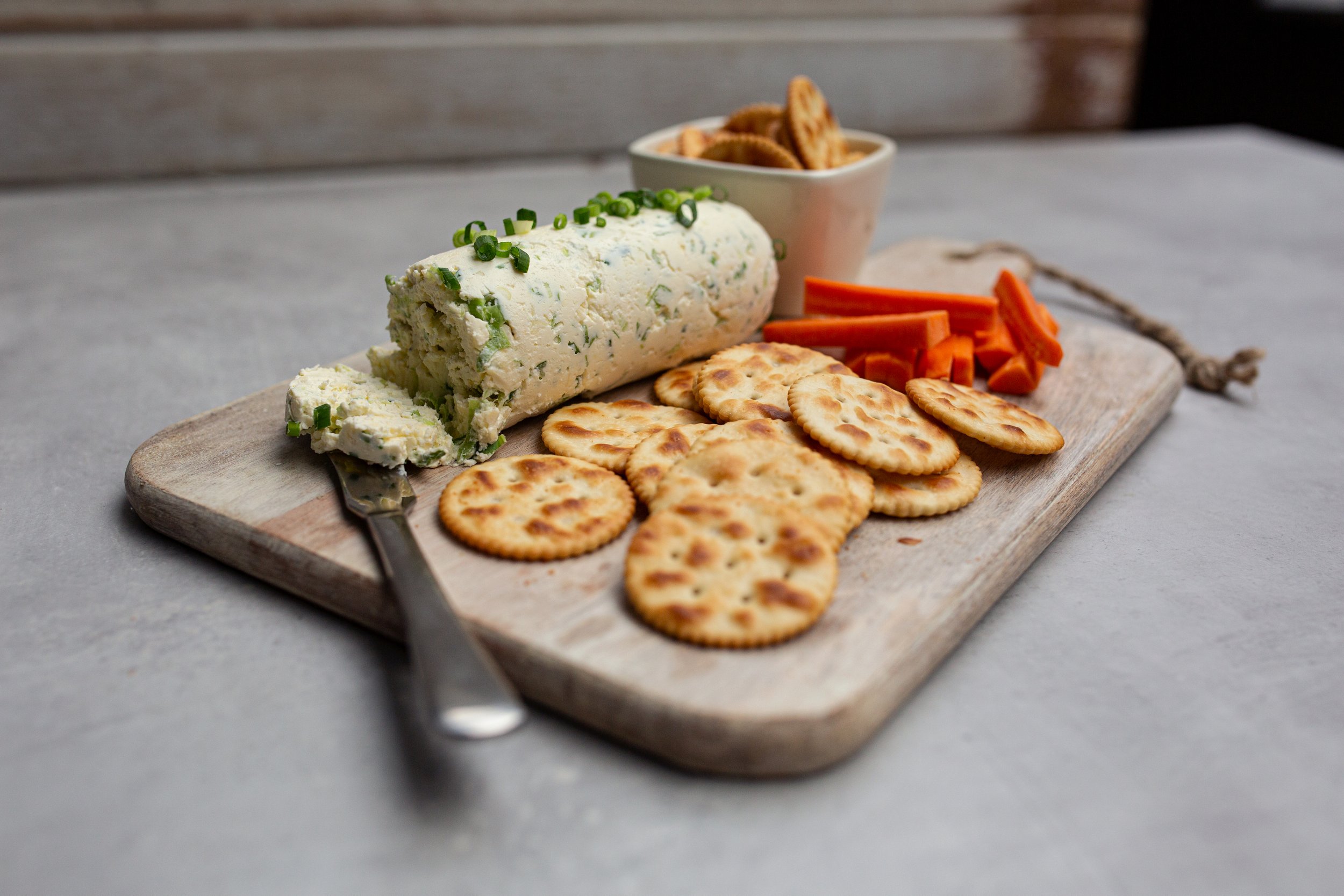
Extensive Product Page reorganisation. Photoshoot to bring forth the concept of 'Eat with your Eyes’ presenting unwrapped products, that on mobile you feel as if you are holding them in your hand. Revised and accessible nutritional information. We developed iconography to quickly scan for allergens whilst simultaneously championing nutritional ratings and sustainability initiatives.
Developed the recipe section of Arnotts.com to house multi dimensional content, filtering capabilities, search functionality, collection curation as well as dynamic product linking to point of purchase.
We created tutorial recipe content to emphasise Arnott’s wide culinary offering, and build credibility in this sector. These videos were developed and created to be housed on the newly developed recipe and culinary hub of the site, as well as to be shared on social driving cross-platform brand interaction.
The product and recipe matrices functioned 3 levels deep to communicate the most efficient cataloging and avoid any duplication. Reducing cognitive load and encouraging seamless cross-navigation, encouraging the path to purchase and interaction with the brand.


With the website uplift we developed brand guidelines targeting the key opportunities identified in the audit. All enhancements leant strongly into accessibility improvements as a baseline.


The ‘Story’ part of the website is an interactive brand story-telling piece. Encouraging cross navigation to products, building brand relationship and recognition through connected history. Illustration and animation developed in line with brand personality and to encourage surprise and delight.
